On 10 August 2026, at 7.34 in the morning, a magnitude 7.4 earthquake with its epicentre in San José del Palmar, in Chocó, shook south-western Colombia. Over the following hours help was organised through the channels that already existed, mostly WhatsApp groups, where lists of collection points and of what was needed in each place were passed around. That kind of information travels very fast and cannot be corrected once it has been sent, so within a few hours a point could already be covered or need something else, and there was no way of knowing without going there.
Out of that came a request, in one of those groups, for a real-time map of volunteers and needs. The map was running by midday the following day. That first night it was already past 1,100 people connected at once and 300 points, nearly all of them posted by people who were on the ground.
Anyone posts a point without signing up, marking where they are with their GPS, an address or a pin on the map, and saying what is happening and what is needed. From then on, whoever is there confirms or corrects it with one tap, adjusts how many people are on site and how many are still missing, and uploads photos or video. Everything is kept in the point’s log with its time.
A point fits on a phone screen and reads at a glance. At the top, its status, whether it needs help, whether there are already enough people and it is better not to come, whether it is a collection centre, and how long it has gone unconfirmed. Below that, two counters anyone can move, the people helping right now and the hands still missing. Then the specific needs as tags, from water and food to breakers, helmets or grinding discs, which whoever arrives can add or cross out. And at the bottom the log, which keeps every change with its time.
The main button is there to say that you are still on site and that what you can see is still current. That is the whole verification mechanism, and it is what resets the six-hour clock.
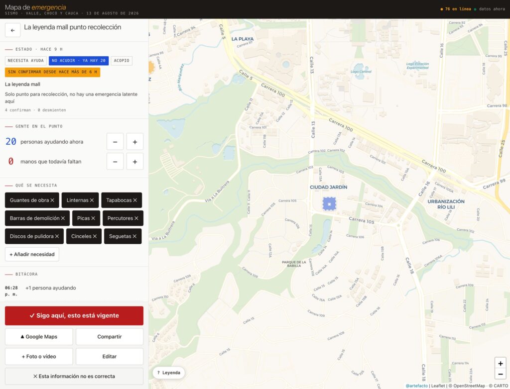
A point, with its status, the people counters, the needs and the log.
Keeping track of everything happening across a whole region, and keeping it up to date, is impossible, least of all in the first hours. So the map does not claim that a point is correct. It says when somebody last confirmed it while standing there, and that time is always visible, in Colombian time, whoever is looking and from wherever.
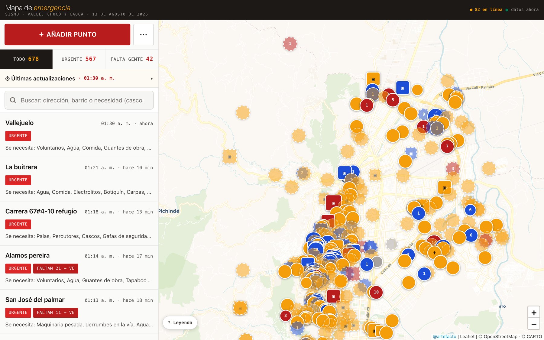
When six hours pass without a confirmation, the information is neither archived nor deleted, it fades. The point appears with a dotted border and a washed-out colour, still there for anyone who wants to go and check, and it stops reading as something certain. It is a way of showing on screen what the map cannot know.
Colour tells you how many people are there. The number inside is people, either the ones missing or the ones already on site.
Shape tells you what kind of point it is.
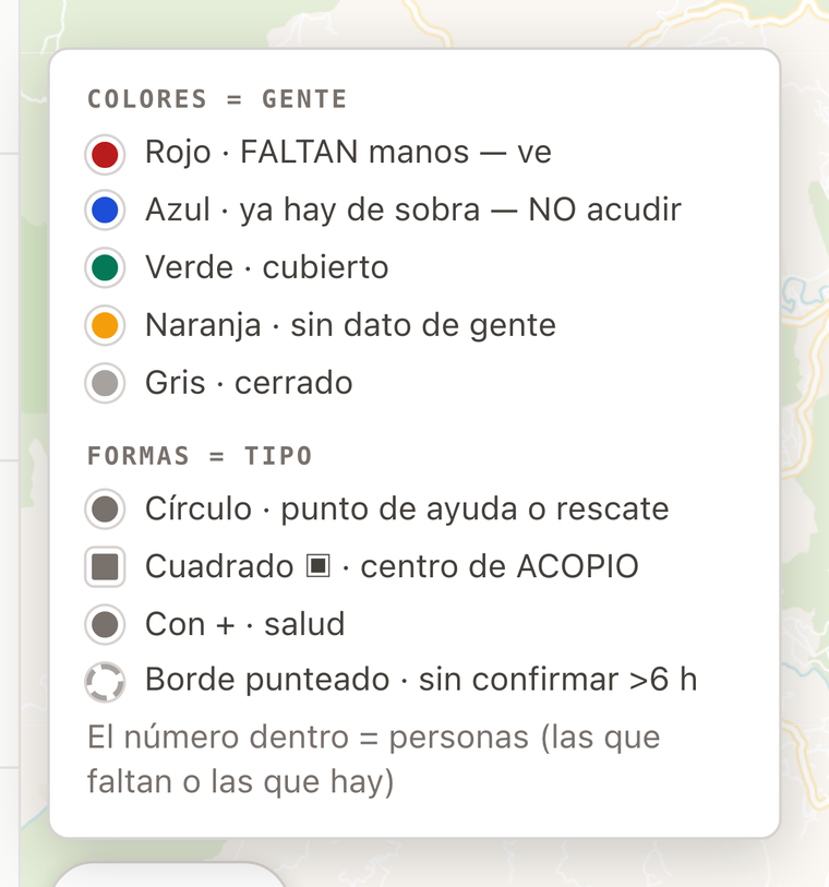
The legend, which fits whole into the corner of the screen.
A map anyone can edit needs a few defences, and they are simple to understand. Each device gets one confirmation vote per point every twelve hours. Counters go up one at a time and have a ceiling. There are rate limits per device and per IP address. And the counter of people looking at the map right now runs on anonymous heartbeats, with no cookies and no tracking.
The “verified” seal is the only closed piece. Only the coordination team can grant it, and it separates points coming from an official or curated source from the rest, which are the responsibility of the community holding them up.
On its first full day the map took around 253,000 requests, with peaks of roughly 1,400 people connected at the same time. 95% of the traffic came from Colombia and almost three quarters from the Cali area, with visits from 19 countries, which was the diaspora following their own people. More than 560 points were posted, some 4,300 different devices confirmed or corrected information, the log passed 8,000 entries and around 245 photos and videos were uploaded.
It helps send hands where they are needed, and there the “do not come” notices on saturated points turned out to be as useful as the alerts on the empty ones. It also helps small municipalities such as Dagua, Buenaventura or northern Cauca become visible. It replaces nobody and solves nothing on its own, it puts together what people already know.
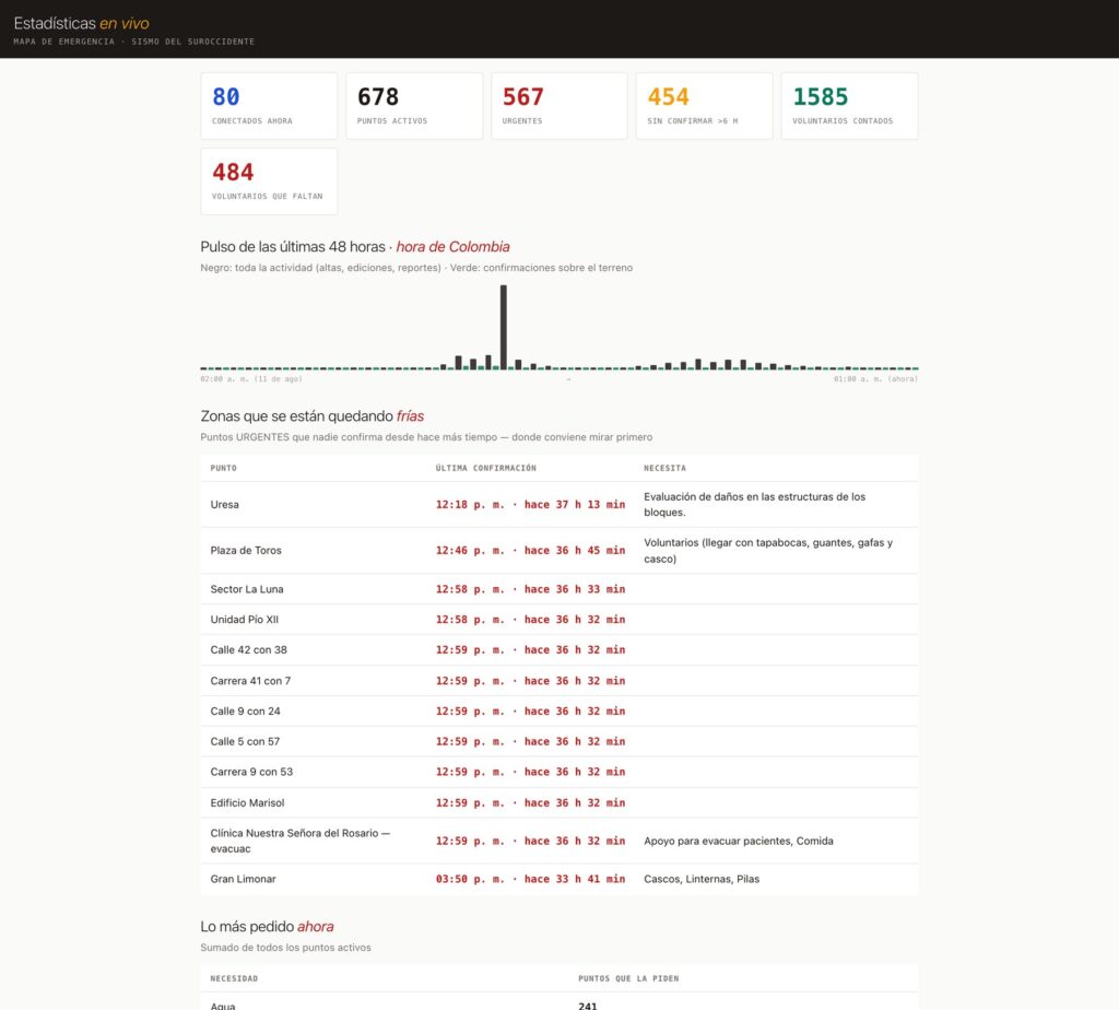
The live statistics, with the pulse of activity and the urgent areas that have gone longest without confirmation.
That aggregate reading is open to anyone on the statistics page, with the pulse of the last 48 hours, the areas going cold, the most requested items across the region and the breakdown of points by municipality.
It is a web application served from the edge of the Cloudflare network, which is what lets it hold thousands of people at once without falling over. It works with the intermittent signal of an emergency, storing changes on the phone and sending them when coverage returns.
The map you see is drawn with Leaflet, a small open-source library for putting interactive maps inside a web page, over the open cartography of OpenStreetMap. The Google Maps layer is served through our own server. When Google’s free daily quota runs out, the application switches to OpenStreetMap on its own and returns to Google when the quota renews at midnight.
There are hourly backups and no data has been lost. The infrastructure is sized for the peak of an emergency rather than for constant use, so the cost only goes up when it is needed and comes back down afterwards.
The classic precedent is Ushahidi in the 2010 Haiti earthquake, citizen reports by SMS turned into a live map that rescue teams ended up using. The collective verification layer has been refined in Ukraine over recent years, with Bellingcat’s civilian harm map, the Centre for Information Resilience’s Eyes on Russia and the live tracking of Liveuamap.
This map leans on all of that and invents very little. The one thing it does differently is switching off on its own, after six hours, whatever nobody has confirmed again. The first version went out the day after the earthquake, and work has continued on it daily ever since, tuning it against what real use kept asking for, how the map reads, the search, the aggregate statistics and the defences against abuse.